• Before and After. Before and After. See how that goes?
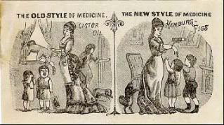 The old "before and after" technique has been around for a long time. Take a look at this advertising card from a century or so back. See the left-hand panel which shows how much trouble the mother has as she tries to give her children the dreaded "old style of medicine": castor oil? Now see the right-hand panel which shows them lining up for the "new style of medicine": Hamburg Figs? Hell, even the dog is trying to get into the act.
There's something about this particular advertising ploy that is timeless. It appeals to our need to see the results of a product. "Here is the way your life used to be," it tells us, "but now look at how it could be."
Generations have grown up seeing the "before and after" of cosmetics, cleaners, diet aids, vitamin supplements, hair tonics, and underarm deodorants.
There are, of course, variations. There's the product comparison, for instance: "their" product versus "our" product. And then there's the contrast between those who don't use our product and those who do.
But all of them share the same basic idea of "before and after."
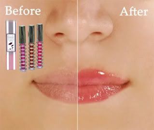
Now with that in mind, what is wrong with this "before and after" picture?

Right! It's an "after and before" picture. Not a "before and after."
And there seem to be a lot more of them than there used to be.
Now admittedly, it only takes a moment to figure out which is the "before" and which is the "after." And perhaps that's fine for print ads (no, it isn't, but we'll let that pass), however, when you're dealing with TV, in which the shot may only last for a few seconds, it can be downright confusing.
One of the worst offenders I've been seeing is a television commercial for a pickup truck (I don't remember which one, and while I could look it up or wait until I saw it again, I figure it's not my job to dig out the name of a product from an ad). The main selling point for this truck is its smooth ride, which they illustrate in a rather clever way: a split screen showing the road from inside the cab of two trucks -- the featured truck and a competitor.
The problem is, the shaky, jittery scene is on the right while the smooth, steady scene is on the left. To the viewer, it looks as though the advertised product (which, by tradition, is always on the right) bounces like a wooden cart plummeting down the side of a gravel quarry.
Does that matter? Well, it took me a couple of viewings to realise what the point of the shot was. I have to imagine that other people faced the same bewilderment when they first saw it.
There are conventions in advertising that have been worked out over the past 100 years. It doesn't do anyone any good to circumvent them (unless, of course, you know exactly what you're doing).
For instance:
- when the selling point of your product is visual, show the product, don't talk about it or show people's faces.
- when your product is cheaper than others, show the price.
- when your product has the potential to appeal to a large number of people, don't put your ads on media used by a small demographic
And of course: Before goes on the left! After goes on the right!